


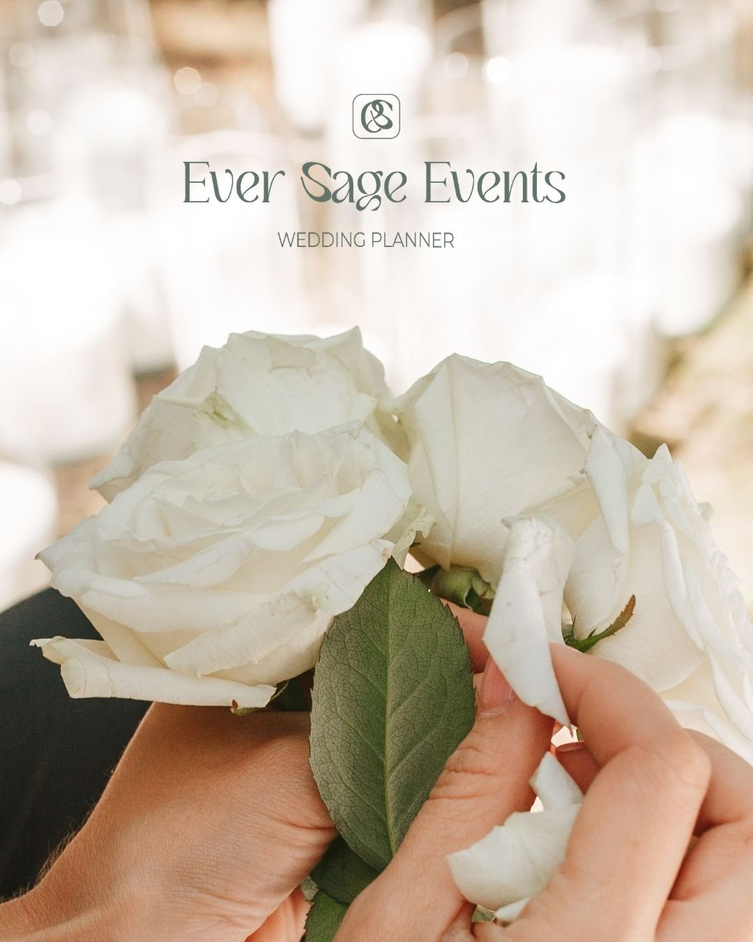
Ever Sage Events
Brand Strategy & Visual Identity
Project Overview
Client: Geneva Blake
Business Name: Ever Sage Events
Location: Southern France & New York
Specialization: Intimate destination weddings & elopements
Geneva Blake approached me to redefine her brand identity and narrative to better attract high-end clients and reflect her unique blend of romantic creativity and strategic precision.
The Challenge
Geneva’s existing minimalist brand felt cold and detached, often drawing budget inquiries rather than her ideal clientele. Her brand lacked the warmth and storytelling necessary to communicate the seamless balance of romance and logistics that defines her work.
Creative Strategy
I crafted a brand narrative around “elevated intimacy,” positioning Geneva as both a poetic creative and a logistical goddess. The goal was to evoke sophistication and warmth, appealing to couples seeking a deeply personal yet flawlessly executed wedding experience.
Visual Identity
Typography: Elegant serif fonts paired with organic, handwritten-style calligraphy flourishes
Color Palette:Dusty Taupe, Sage Green,soft Moss,Warm Linen
Design Elements: Subtle linen textures and delicate flourishes balance luxury with approachable warmth
Brand Archetype
The Lover: Embodying passion, intimacy, and connection, the brand invites couples to experience weddings as deeply emotional and meaningful celebrations.
The Caregiver : Reflecting Geneva’s nurturing and detail-obsessed approach, ensuring clients feel supported every step of the way.
Together, these archetypes position Ever Sage Events as a warm, sophisticated partner for couples who want romance with precision.
The Result
The refreshed brand identity for Ever Sage Events now communicates both the emotional elegance and strategic precision that define Geneva’s work. Every visual element from typography to palette was carefully selected to reflect her niche of high-end, intimate weddings.
The color palette plays a central role in establishing tone and mood:
Dusty Taupe: Adds softness and sophistication, evoking warmth without being overly feminine. A grounded, elegant neutral that speaks to timeless romance.
Sage Green: Represents calm, natural beauty, and trust connecting to Ever Sage’s destinations in France and the organic nature of elopements.
Soft Moss: A muted, airy green that adds freshness and balance. It supports the brand’s quiet luxury aesthetic and editorial feel.
Warm Linen: Brings a sense of lightness and softness. It acts as a gentle foundation that pairs beautifully with textured visuals and blush accents.
Together, these tones create a visual experience that is sophisticated but not sterile, romantic but not overly delicate a perfect match for Ever Sage’s refined, warm, and highly curated approach.
This elevated identity now attracts couples who value meaningful storytelling, fine detail, and a stress-free planning journey with someone who truly understands both the beauty and the logistics behind unforgettable weddings.
